Showing posts with label colour. Show all posts
Showing posts with label colour. Show all posts
Sunday, 16 January 2011
Sunday, 7 November 2010
natural paints
Intrigued by the idea of making my own paints I gathered as many natural materials as I could before the frosts made it too late to collect berries for another year. Some materials I simply crushed and extracted the juice, others were boiled in water or vinegar. I used pva glue as a binder to make a basic kind of acrylic paint.


Unsurprisingly the colour variations are quite subtle. candle soot and turmeric were the only really strong tones but with a bit of mixing I covered most colours except green and blue. Concentrated grass juice would probably give a green and that could be mixed with a purple could start hinting at blue?


Natural paints used to create some blatant Euan Uglow still life copies
Friday, 5 November 2010
colour
A couple of weeks of colour theory. While I do not use colour much at the moment, understanding more about it should help me be more effective with what I do use.
Following a suggestion from an artist friend and playing with complementary colours, I painted up a piece of wood in violet and ultramarine to use as a base for the yellow/orange Uglow beakers (yellow-violet and orange-blue being compliments);


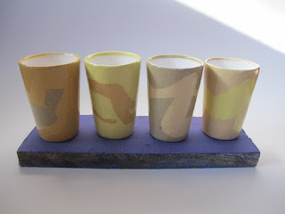
Following a suggestion from an artist friend and playing with complementary colours, I painted up a piece of wood in violet and ultramarine to use as a base for the yellow/orange Uglow beakers (yellow-violet and orange-blue being compliments);

on plain white background

on ultramarine painted background

on violet painted background
In theory, complementary colours should make each other brighter when placed next to each other. Not convinced by this example - to my eyes the yellows and oranges look most vivid on the plain white background. However, the strong ultramarine blue does lift the overall composition and look good next to the beakers.
I was so focussed on taking the pictures that I did not really compare the set-ups visually, just set them up and took the pictures thinking I could compare on screen. However, I do not trust the camera completely as it was on auto and may have been adjusting factors to compensate for the colours. Although all pictures taken in same spot within 1 minute, they do look different and I think that when presented with a strong colour in the frame, the camera was overcompensating by making the overall picture lighter. More investigations, trusting my eye rather than the screen and manual camera settings needed...
Subscribe to:
Posts (Atom)

This work is licensed under a Creative Commons Attribution-NonCommercial-ShareAlike 3.0 Unported License.